

September 6, 2026
Here’s my latest 4×6 inch piece, which I’ve titled “Snacks.” It was fun to make…sorta.
The technique I used for this one involves searching online archives of old magazines from the 50s and 60s to pull from that era. I go through PDF files, perform digital cutouts of the elements I want to use, and save them. For example, the Red Cadillac was from an ad, so I used the Windows Snipping tool to capture it. I really enjoy the digital clipping process—it beats hunting for physical old magazines. Once I have the elements, I assemble them on a 4×6 layout or artboard in Photoshop.
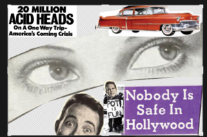
While putting this together, I kept finding themes related to anti-drug propaganda and anti-communism. One magazine I came across—I think it was a celebrity magazine—claimed that Hollywood wasn’t safe anymore. Seeing this stuff reminded me of the scare tactics I grew up with. I remember a sheriff’s deputy in the sixth grade showing us a case of drug samples and telling us that marijuana would cause birth defects. I didn’t even know what marijuana was at the time, but the propaganda was everywhere.
I love how the counterculture from the mid-50s to the mid-70s clashed so heavily aesthetically; from advertising to protest posters, etc.You had one side warning against long hair and anything “evil,” while the other side embraced it. Exploring that culture through graphic arts is fascinating. I love seeing where cut-and-paste techniques were used, along with gouache for offset backgrounds, ink, and letraset rub-on lettering. I really enjoy channeling that old offset-press style—it’s particularly fun with my modern technique.
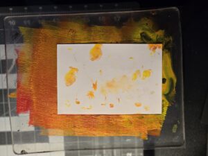
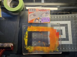
After yesterday, I decided to experiment with a red and yellow color palette. I assembled the digital cutouts on a 4×6 artboard in Photoshop, printed them, and cut out specific areas. I actually destroyed the first print, but for the second one, I placed it face-down on my gel plate. I wanted to experiment with color, so I used Cadmium Medium Red and Cadmium Medium Yellow acrylic. I tried a bit of blue, but it didn’t work out well, so I layered the yellow and red instead. There was a slight shift in the layering, but after letting it dry, I was able to pull it off the plate.
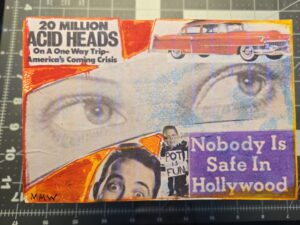 The final result looks really cool. It captures a lot about the counterculture of that era. This piece is officially part of my collection, and I hope you enjoy it. I’ll be posting some pictures soon, and I might do a high-resolution scan once it’s fully dry and sealed with UV varnish. Anyway, have a good one—talk to you later.
Peace and love, man.